
People remember visual information better than words or numbers, and one of the most common providers of visual information is logos, which can be found on all everyday products. And yet, some products are more popular than others, which can be explained by the product logo design techniques used, which make the product more visually appealing to potential customers.
We offer an insight into the most recent recent logo design trends and techniques.
 Negative Space
The use of negative space is one of the most popular logo design techniques today. This technique can be used to incorporate two or more elements into a single logo using different color tones. Many graphic designers recognize this technique as one of the best in creating uncomplicated but apt logos.
The downside of the technique is the fact that it is possible to include elements in the logos that are not always immediately noticeable to customers, but as a result, these types of logos are among the ones that customers remember best.
 Lineart
The use of lines in the development of logos is a popular, simple and positively appreciated design technique. The logos created in this technique consist only of straight and curved lines, which are usually drawn freehand in graphical computer programs.


 Dynamic Letterpress
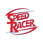
Among graphic designers, the use of dynamic linear elements is a widely used technique for creating impressive logos. Its main element is the lines of different thicknesses that seem to "flow out" beyond the outlines of the logo, thus giving it a dynamic "movement" effect. This is one of the most popular logo design techniques today.
The most important in this technique are linear elements of different thicknesses and purposeful placement.
 Gradient Mesh
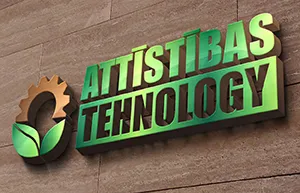
One of the latest logo design techniques is the coating of transient tones, which is characterized by curved and spun figures in layers that overlap, thus achieving a spatial effect. The choice and application of colors are very important aspects of this technique.
This technique is used relatively infrequently, as its main purpose is to achieve a three-dimensional effect in the logo, so a temporary shade overlay is used only when the company's main motto needs to be reflected.


Polygon Abstract
Although the name of this technique sounds complicated, abstraction with landfill elements is one of the simplest techniques that gives logos an interesting visual look. The main elements in this technique are triangular shapes and color transitions, which give the design a three-dimensional folded paper effect. Currently, abstraction with landfill elements is one of the most common logo design techniques, especially popular with companies that want to impress their customers and competitors with an innovative brand design.

 Overlap Technique
The coating technique is characterized by overlapping elements in layers. This arrangement of elements is designed to achieve a three-dimensional effect, but the use of color tones and shading in this technique creates a dynamic sense of spatiality. One of the most successful logos is the international online store eBay.
It is possible that the overlapping letters in the eBay logo are designed to resemble a crowd of buyers in the market, thus emphasizing the company's industry and core values.


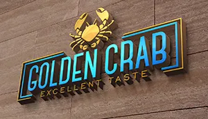 3D in 2D
This technique is probably the latest trend in modern logo design. The emphasis here is on achieving a three-dimensional effect on the two-dimensional logo with transient color tones and textures. Logos created with this technique have a more effective visual impression, so such logos are chosen by companies that are important to become visible in their field - both when providing their services and by standing out with their company design.

This is a small insight into the latest logo design techniques that can help you improve your company's design to ensure even more effective communication between your company and potential customers. And yet, you have to decide for yourself which of these techniques is most appropriate for your company logo.